Menus rarely include enough detail.
A dish name and photo may be all the system receives. Portion size, ingredients, preparation, sugar, sodium, and cross-contact details can be incomplete or absent.
Ordering for a health condition gets harder when the menu says almost nothing. We explored how AI could use available details, provided or estimated portion size, and established food patterns, then make its uncertainty visible.
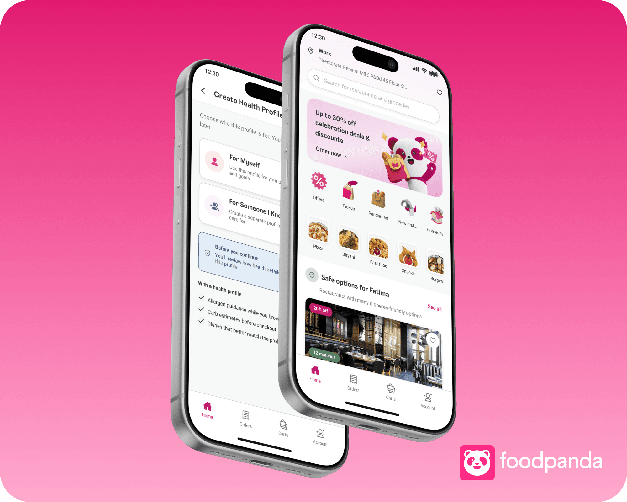
A dish name and photo may be all the system receives. Portion size, ingredients, preparation, sugar, sodium, and cross-contact details can be incomplete or absent.
The concept compares available menu details with provided or estimated portion size, established food patterns, profile context, and other relevant signals.
The interface should explain what was inferred, how certain the signal is, and what is still missing. Low confidence leads to a question or no recommendation.
For Human Centered Design for AI Systems, we studied a familiar delivery-app gap. Restaurants often share too little detail. AI could help only if the interface separated known, inferred, and missing information.
Human Centered Design for AI Systems, Fall 2025
Three-person course team. I worked across research, synthesis, AI product design, UX, and the interface system.
A foodpanda add-on explored as a concept, not a shipped feature, clinical tool, or medical recommendation system.
A dish may have no portion size, ingredient breakdown, cooking method, or nutrition detail. The system had to combine available information with established food patterns and profile context, without turning an estimate into a medical promise.
Before designing a profile, we listened to health communities, followed everyday food decisions, and looked at the products people already used.
We read conversations on Reddit, Quora, Facebook, WhatsApp, and patient forums to understand the language people already used.
We posted realistic scenarios and watched what people asked back, shared from experience, warned against, or passed to a professional.
The conditions changed, but the same practical questions kept appearing.
We compared recipe, nutrition, and allergy products to see how they explained a signal and what they asked someone to do next.
Personalized recipe recommendations
Health tracker and nutrition scanner
Nutritional app for mindful eating
Food allergy app
Public conversations across health and patient communities
Realistic condition-led questions shared with online groups
People managing a condition, family care, and everyday food choices
Packaging, shops, menus, staff, and the checks around one meal
Clinical boundaries and four adjacent nutrition products
We joined spaces on Reddit, Quora, Facebook, and WhatsApp where people already discussed diabetes, thyroid conditions, PCOS, hormonal changes, allergies, and heart health.
Alongside reading existing threads, we posted realistic messages from the point of view of a fictional person managing a condition. We studied the response, not whether the community produced a medically perfect answer.
These were not invented audience segments. They were active communities where people were already helping one another.
326.5K members
A large Pakistani community where women discuss everyday health, family, and care decisions.
17K members
A diabetes-focused community built around practical support and lived experience.
15K members
A condition-focused community for questions about PCOS, food, treatment, and daily routines.
We varied the person and condition to see what changed in the response.
A parent trying to make a practical food decision for a child managing Type 1 diabetes.
Someone balancing everyday meal choices with thyroid, PCOS, or other hormonal concerns.
Someone asking about ingredients, preparation, sodium, or cross-contact before choosing a meal.
The conditions changed, but the shape of a useful response was surprisingly consistent.
People usually began with what had worked for them or someone they cared for.
Replies moved toward a familiar product, a portion change, a restaurant question, or another small next step.
Age, condition, medication, symptoms, and the exact food often changed the answer.
When the risk became personal or unclear, people pointed back to a doctor, dietitian, or pharmacist.
PCOS conversations and lived experience
Everyday food decisions and practical support
Condition-led questions and peer responses
The part that stayed with me was how social the answer was. People led with personal experience, offered a practical shortcut, asked follow-up questions, and pointed toward professional help when the uncertainty became serious.

Personalized recipe recommendations.
Useful for preference-led discovery, but separate from the restaurant order.

Health tracker & nutrition scanner.
Strong at turning a scan into a score, but the person still has to interpret the result elsewhere.

Nutritional app for mindful eating.
Its calm language was useful, but it was not built around condition-aware restaurant ordering.

Fig: Food Scanner
It showed how filters can become a result, but the quality still depends on available ingredient data.
We did not need to copy another score, scanner, or recipe feed. The useful pattern was the explanation beside the result and a clear next action.
For foodpanda, that meant carrying the profile and the reasoning behind each estimate through discovery, dish detail, cart, and settings instead of building another standalone nutrition tool.
We followed the checks available in a shop with no digital layer and limited condition-aware guidance.
We checked label clarity, product organization, staff responses, and the work required to compare everyday items.
At Novu, Arcadian, and Cheezious, we compared menu detail with what staff could explain about ingredients and preparation.
In a timed shopping exercise, buying six everyday items for a Type 1 diabetes scenario took 10 minutes. Buying the same six without the condition-led checks took 4 minutes.
Bread
Eggs
Milk
Biscuits
Ketchup
Fizzy drink
Each item required checking labels, sugar, ingredients, and whether the available information answered the scenario.
Can I tell which dishes fit the active profile without opening every item?
Can I understand the recommendation and the reason behind it?
Can I see how the choice changes the profile context before checkout?
What does someone need to know before choosing a dish?
Which details are useful at menu level and which belong deeper in the flow?
How should the product explain a warning without sounding clinical?
How can one account support meals for different people?
Where should the product stop and direct someone to professional advice?
The product could not promise that a dish was medically safe. AI could estimate what may matter from the available signals, explain the basis, flag missing information, and leave the decision with the person ordering.
People already have a system. They ask someone they trust, return to the same meals, read labels, or avoid the choice altogether.
The friction was not only missing information. It was assembling the answer from scratch every time someone ordered.
Trust is personal
Social context changes the choice
A warning needs a reason
The opportunity was not to invent certainty. It was to use AI to organize incomplete context, explain the estimate, and keep the person in control.
A theme synthesis from participant interviews, community responses, and conversations about family care. Individual identities are omitted.
People may know what they want to avoid, but the choice still happens around family, friends, and shared meals.
What changed in the design: keep the profile optional, quiet, and easy to switch.
A colour or score is not enough when the consequence feels personal. People need to know what the product noticed.
What changed in the design: show the available evidence, the inference, and what is still unknown.
When the information is hard to judge, returning to the same small set of meals can feel safer than trying something new.
What changed in the design: carry the profile through discovery, dish detail, and cart review.
AI could organize available food context, estimate what may matter, and explain its reasoning. It could not diagnose, prescribe, or promise that a dish was safe for a specific person.
It is dinner time. A parent is ordering for the family, but Fatima's meal needs its own context before the order reaches the cart.
Choose Fatima's profile without changing the rest of the family account.
See the estimate, what informed it, and what the restaurant did not provide.
Review the meal against the saved context and decide whether more information is needed.
Needs ingredient and cross-contact context before deciding whether a restaurant or dish is worth a closer look.
Knows what she wants to consider, but delivery menus do not carry that context into discovery or comparison.
Wants sodium and portion context without turning a shared meal into a public conversation about his health.
The working board contains the deeper profiles and mapping:Explore research board →
01
Health details are opt-in and explained before personalization begins.
02
Guidance appears beside the food decision, not in a separate health destination.
03
The result separates known details, inferred context, and missing information.
04
Low confidence leads to a qualified result or no recommendation.
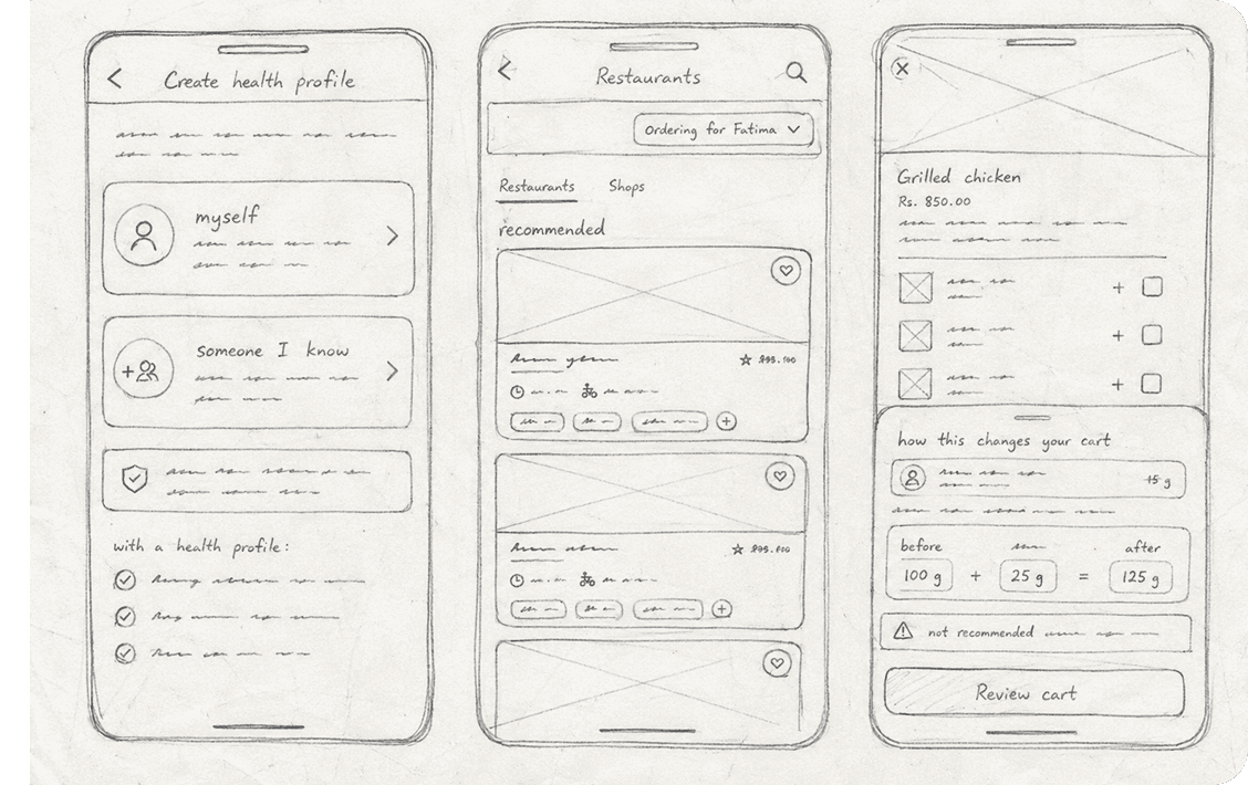
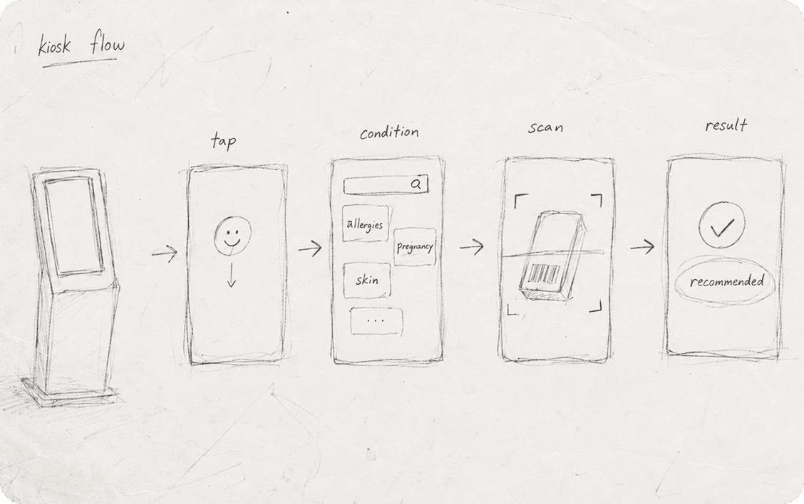
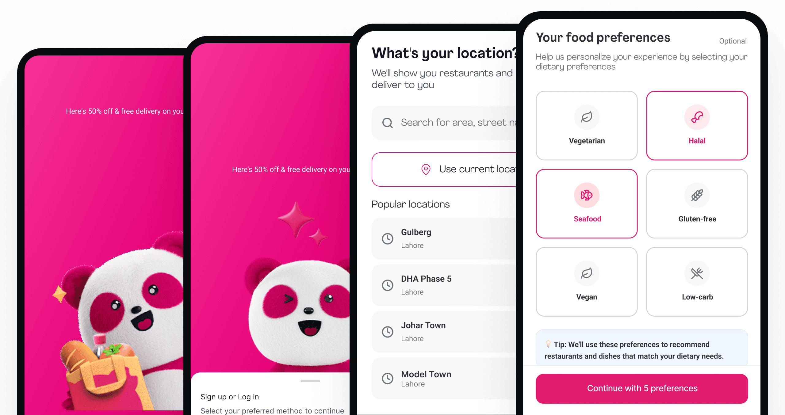
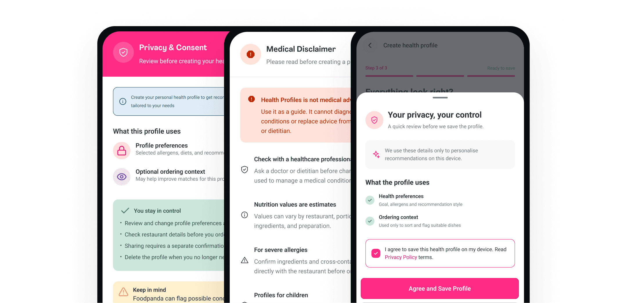
The product explains which details inform the analysis, how estimates are produced, and where the guidance stops before asking someone to create a profile.
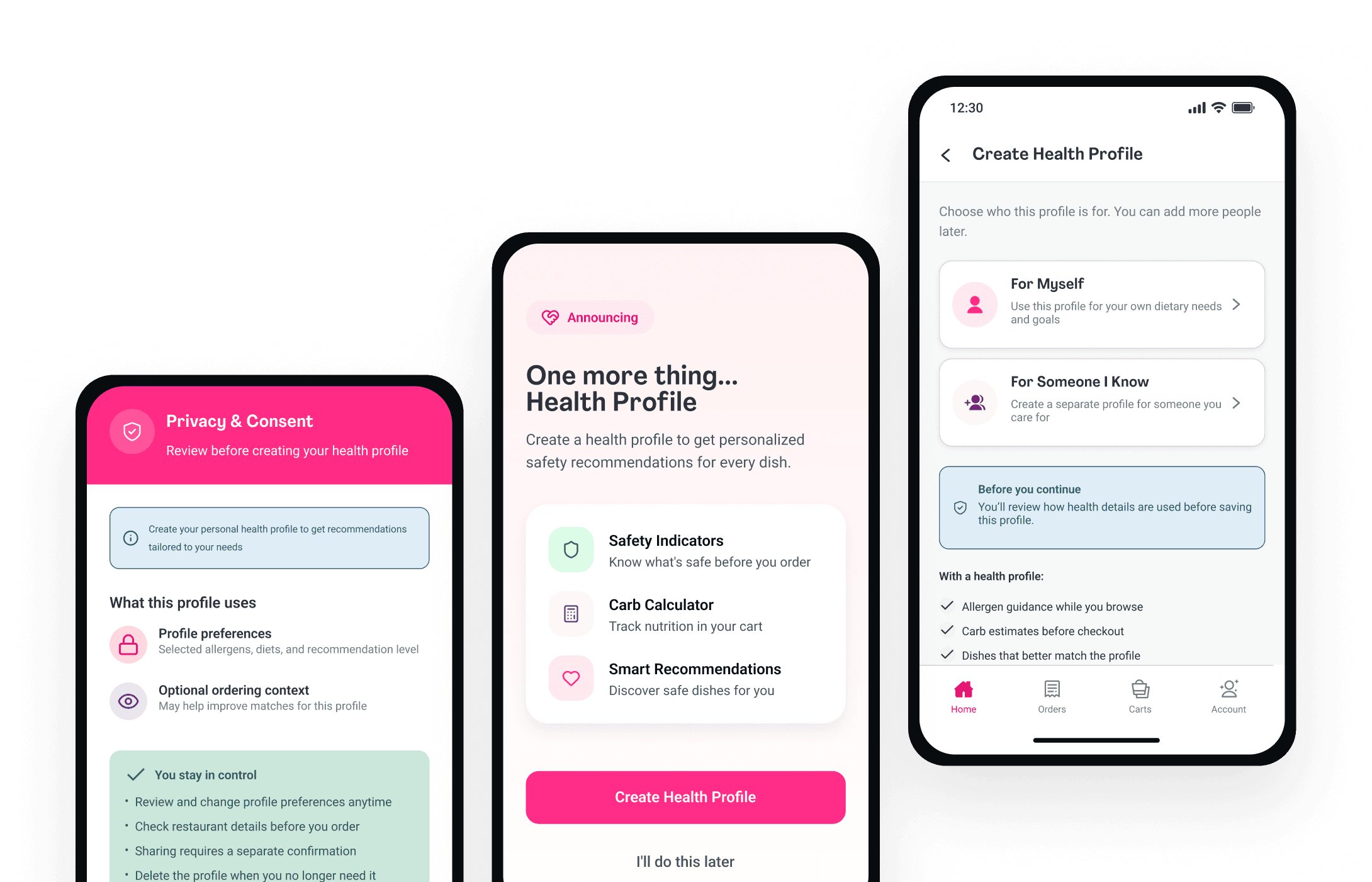
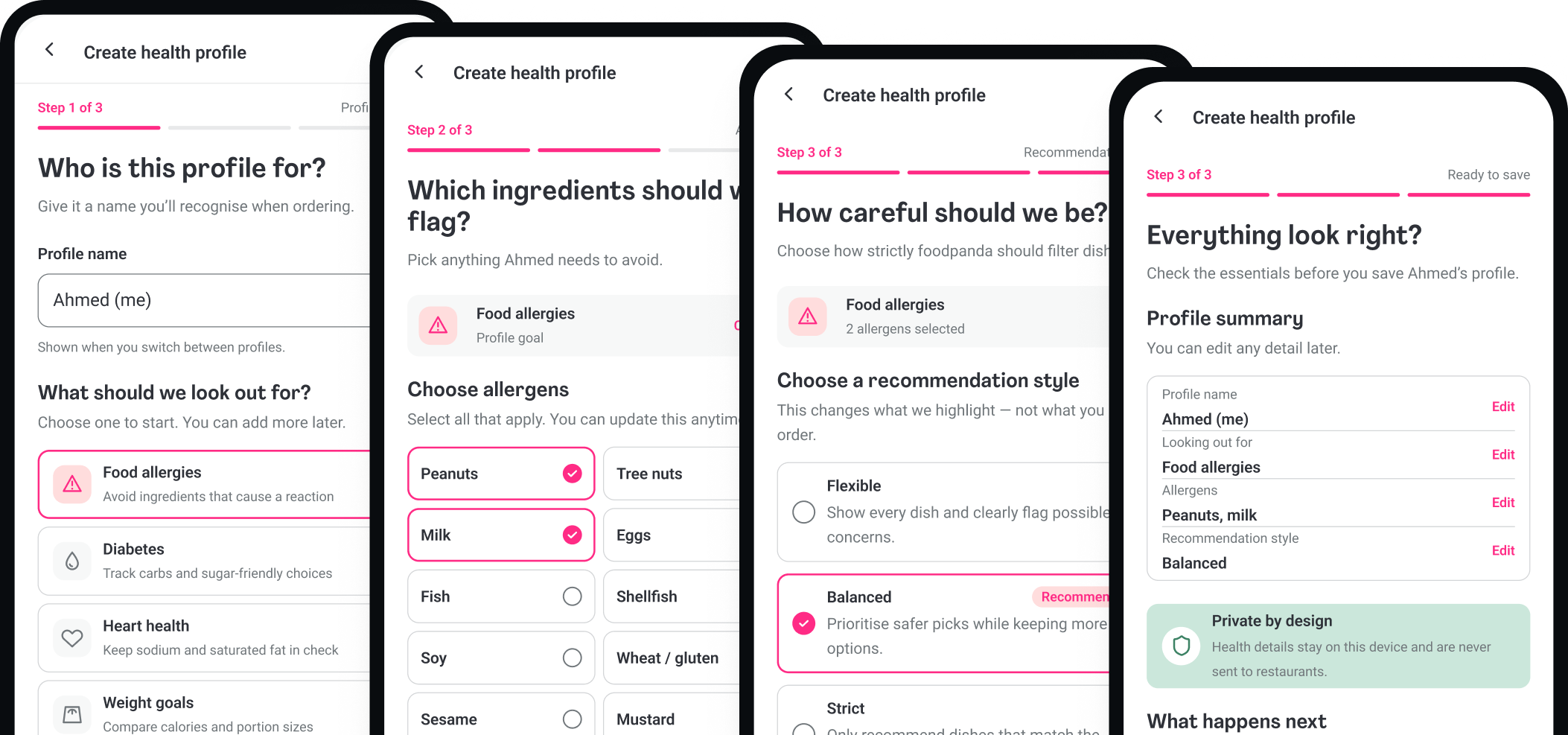
The flow asks who the meal is for, what the product should flag, and how much guidance the person wants. Nothing is saved before they can review it.
Consent, model boundaries, and profile control appear before foodpanda begins analyzing the available menu context.
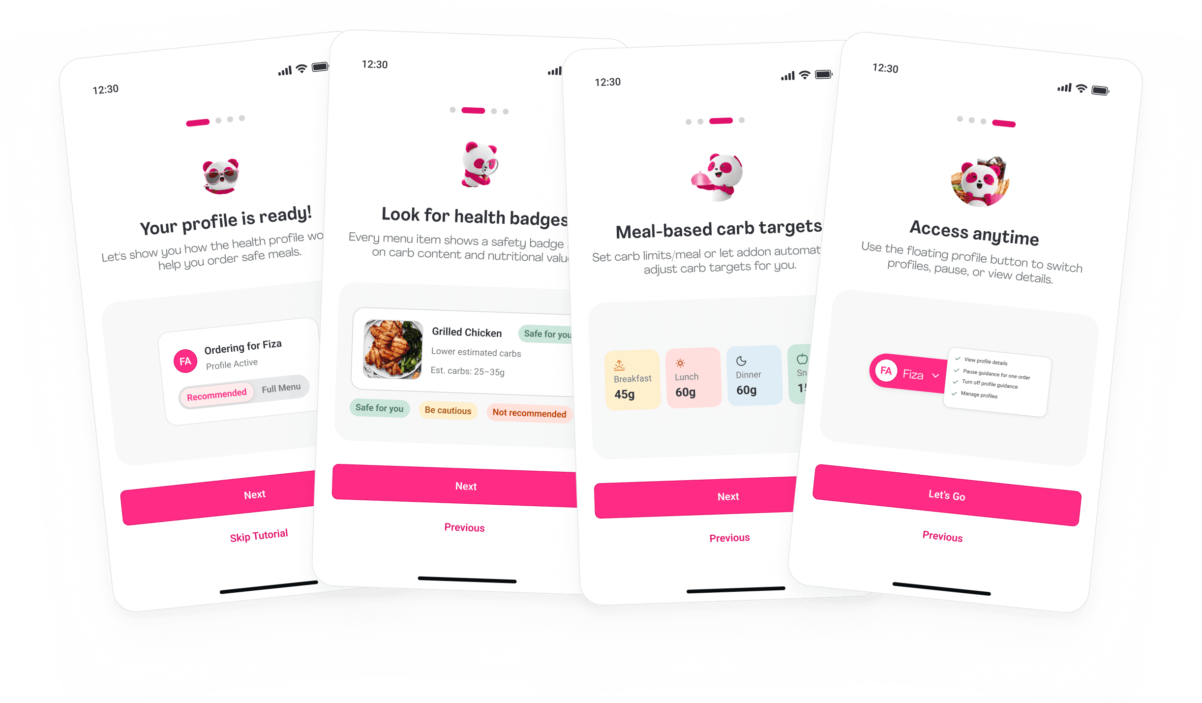
We kept the active profile visible from discovery to cart. When restaurant data was incomplete, the concept used available menu details, provided or estimated portion context, and established food patterns to estimate what may matter.
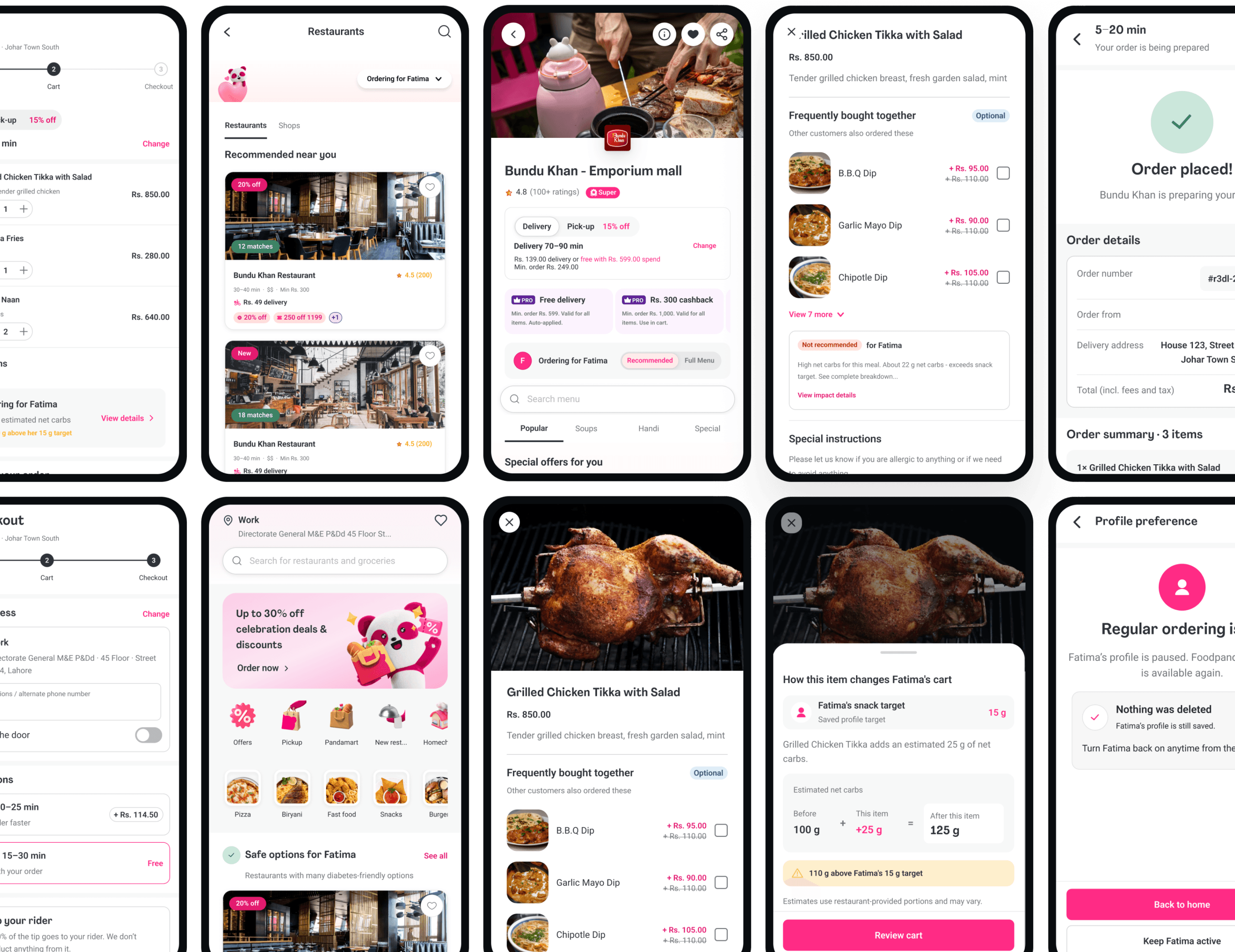
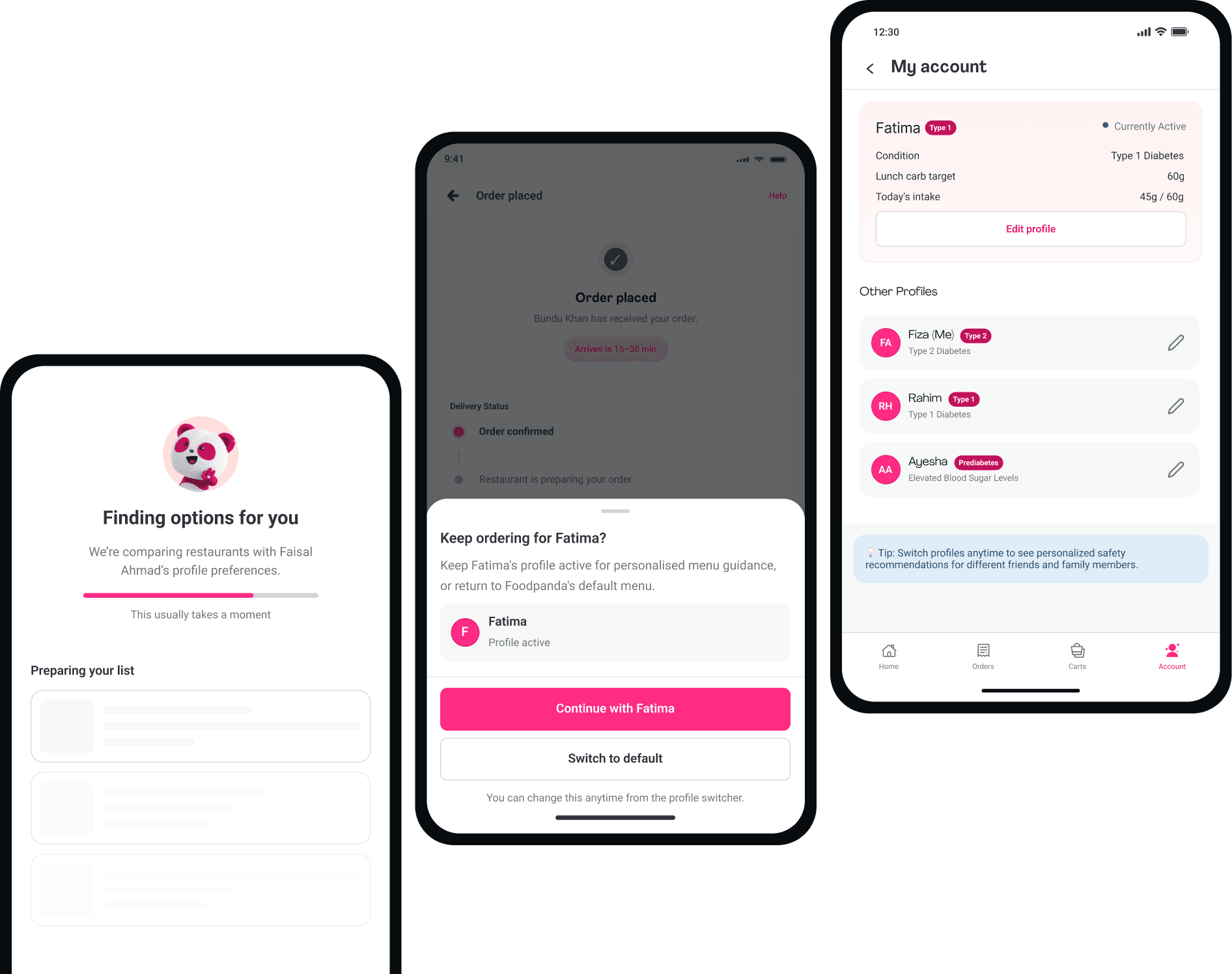
The profile, AI estimate, cart, checkout, and account all use the same language. The known details, assumptions, and uncertainty should not change as the person moves through the order.
The switcher stays near the menu so people can see and change the active profile without leaving the order.

I used the short label for scanning and kept the explanation one step away. The product should never ask colour alone to carry a health decision.
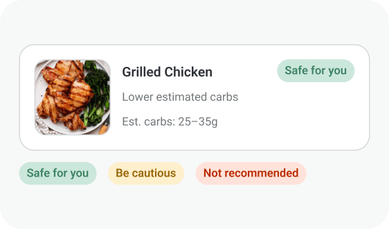
A short label helps with scanning. The reasoning remains available when someone wants to see what the system used and what it had to infer.
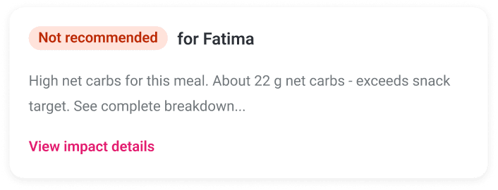
When an item may not fit the active profile, the interface explains the available evidence, the estimate, and any missing information behind the signal.
The estimate has to travel with the order. These two views show what may change, what the system used, and where the information still runs out.
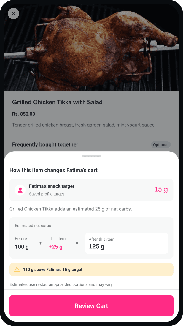
The cart carries the same estimate forward so someone can review its reasoning and limits before placing the order.
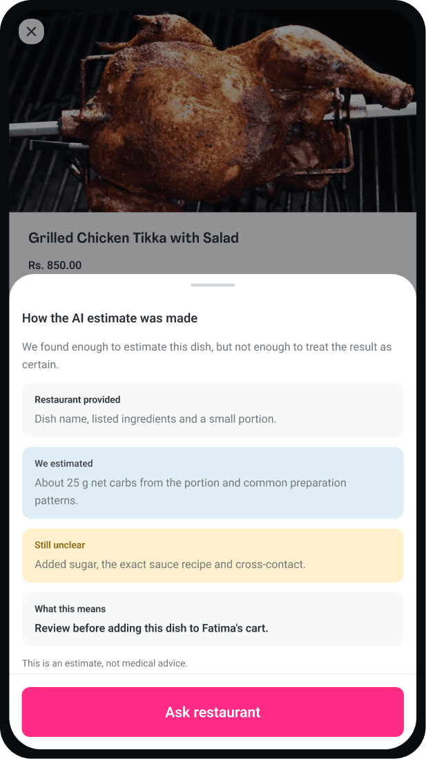
The explanation separates restaurant details from the AI estimate and the information it could not confirm. If something important is missing, the person can ask the restaurant instead of trusting a complete-looking answer.
We designed waiting, switching, editing, and post-order states too. The AI also needed a state for missing information, delayed analysis, and a result that could not be confidently produced.
We brought colour, type, spacing, status language, and components into a compact system. The difficult part was keeping facts, estimates, warnings, and missing information visually distinct across the flow.
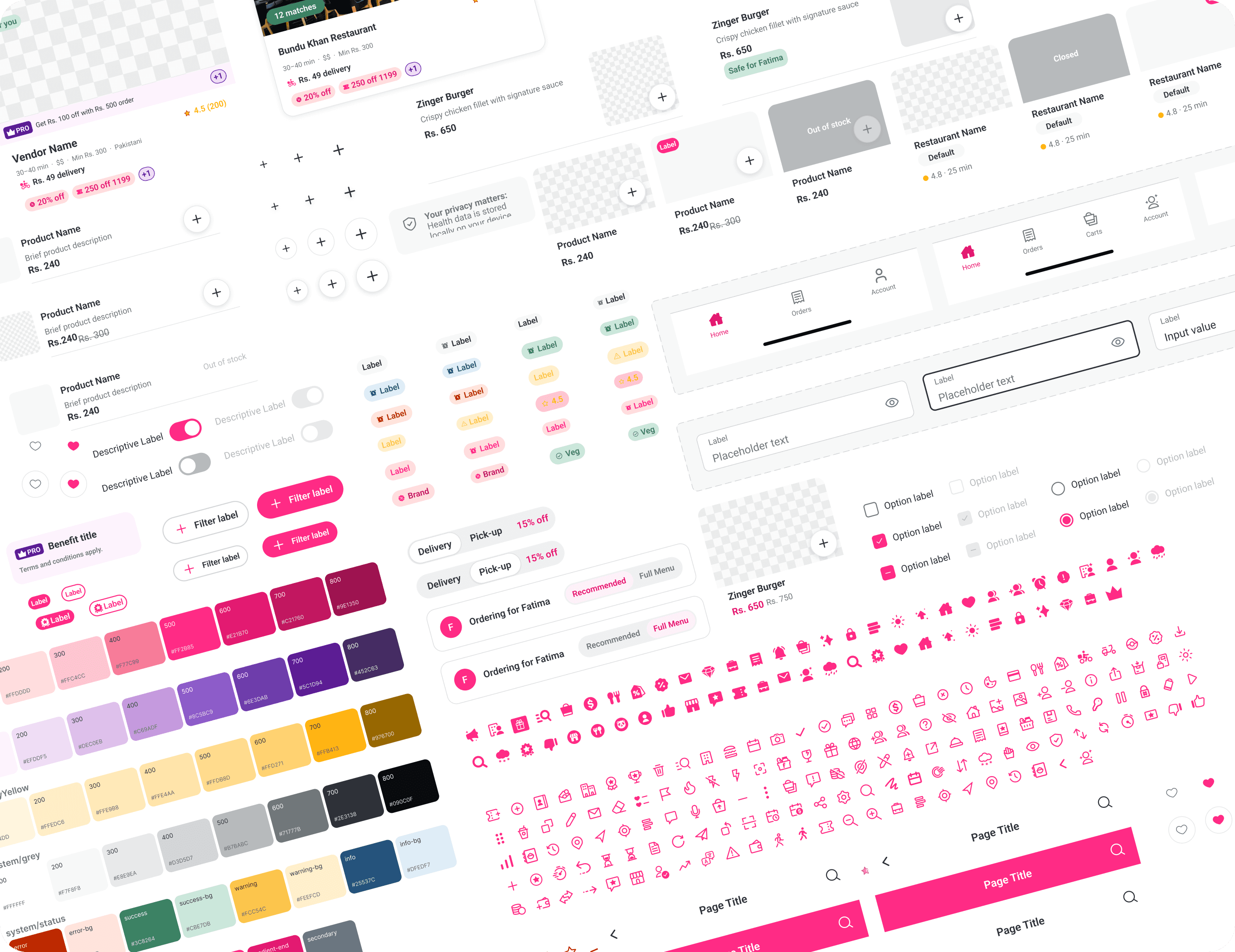
Colour, type, spacing, and status values became explicit before we refined more screens.
Provided details, AI estimates, and missing information use the same language wherever a choice happens.
Loading, incomplete data, low confidence, closed, and out-of-stock states belong in the system from the start.
The system is small enough for a concept, but clear enough for the next screen to reuse without guesswork.
The final screens look settled. Getting there was not. I changed direction several times, rebuilt weak ideas, and kept asking the same question: does this feel like foodpanda, or like a health product pasted on top?
There was no usable public design system when we began. The files we found were outdated or incomplete, and our request to the foodpanda design team went unanswered.
Working inside a familiar product was harder than starting from a blank canvas. Small changes felt foreign quickly. Several directions were rejected before we found the balance.
Restaurant information could be incomplete or misleading. Staff did not always know ingredients or preparation details, leaving people managing a health condition to spend longer checking an order without a dependable answer.
The same friction appeared in departmental stores. Products were grouped by category, but finding the right option still took time. A language barrier made an already difficult decision harder.
People did not always want to discuss personal health conditions openly. Every name in the research and case study is a placeholder, and individual identities remain private.
Constraints made the work sharper. The add-on could not overwhelm the ordering flow, so every label, warning, and extra step had to earn its place.
A design can match the brand and still feel wrong. I had to judge rhythm, density, hierarchy, and behavior together, not simply copy colors and components.
People already help each other fill information gaps. Communities share lived experience, precautions, and the point at which someone should speak to a professional.
Sections and labels do not remove the work of choosing. In stores and restaurants, people still need help translating what is available into what fits their situation.
Privacy is part of the design, not a disclaimer. Composite profiles let us show what the research changed without turning private health stories into portfolio material.
We built a connected concept from profile setup and restaurant discovery through dish reasoning, cart impact, checkout, and profile control.
When Bento appeared publicly on Zeroheight, I used the foundations available at the time to bring the concept closer to foodpanda's product language.
The final direction makes the reasoning inspectable. It separates restaurant-provided details, AI estimates, and missing information before someone commits to an order.
The work also produced a compact extension to the design system for consent, health profiles, status language, warnings, loading, low-information, and switching states.
I would explore a recommendation assistant built around a familiar behavior: people often decide what to eat by seeing what others ordered and enjoyed. It could use order history, review patterns, and follow-up questions to suggest three dishes.
I would test whether it should appear only after someone has browsed several restaurants, how easily it can be dismissed, and whether three suggestions reduce decision time without feeling intrusive.
I would work with restaurants on a better ingredient and preparation workflow. The AI layer becomes safer when the source information improves instead of asking inference to carry the whole burden.
I would test the reasoning model with nutrition professionals and people managing different conditions, then measure decision time, comprehension, and when someone asks for more information.
We tested paid and free AI design tools. None produced a screen I was willing to keep. The generated work missed the product's rhythm, hierarchy, and restraint. We kept those attempts beside the hand-built iterations in the project record.
AI was more useful behind the scenes. I used it to organize interview notes, surface recurring patterns, support persona development, synthesize research, and trace insights back to design decisions. I reviewed and shaped every output.
Inside the concept, AI fills a different gap. When restaurant data is incomplete, it can estimate from menu details, portion context, and established food patterns. The interface shows what it inferred and what it still does not know.
The hardest part was not inventing a health feature. It was making the feature useful, private, explainable, and quiet enough to feel at home in the product people already knew.